Pulse Shopify theme
A modern DTC storefront of rounded tiles and a pinned hero. A floating island header, pill buttons, a bento rhythm and a hero stage whose layers move with the scroll. Built for beauty, wellness, electronics and sports brands.
Price set in the Theme Store.

Try Pulse in place
Open full demoA sample store built from the Pulse art direction. Use the bar to switch the look, light or dark and the color scheme; the demo changes in place. It is stand-in content with system fonts, not a live shop.
The page follows your device's light or dark setting; the demo follows the look you pick.
Beauty and wellness
Made to move with you.
Rounded cards, a bold sticky header and quick add on every product. Built for beauty, wellness and direct to consumer brands.
Start your routineBest sellers
- Barrier SerumHydrating · 30 ml
- Daily Mineral SPF 50Fragrance-free · 50 ml
- Night Repair CreamVegan · 50 ml
- Gentle Gel CleanserSensitive skin · 150 ml
What makes Pulse different
- Pinned hero stage with scroll-driven layers and no JavaScript by default
- Floating island header and full-screen menu
- Product page with sticky media and data blocks: ingredients, steps, specs, comparison, hotspots
- Tile cards with a benefit chip and a round add button
- Cart drawer with six states, including gift and progress bar
The Pulse design system
Everything a preset is made of, from the settings and tokens the theme ships. Change a preset and these values change with it.
Color schemes
Four schemes per preset, assigned to any section. The ratios are computed from the hex values the theme ships: text is held to 4.5:1 and interface parts to 3:1 at build time, and a preset that fails does not compile.
Pulse Beauty and wellness
Cloud
#F5F6F8 · #0D1117 · #4A2FD6
- Text on background
- 17.5:1 AAA
- Button label on button
- 17.5:1 AAA
- Accent on background
- 7.3:1 AA
Blush
#F6E7E3 · #1B1013 · #4A2FD6
- Text on background
- 15.4:1 AAA
- Button label on button
- 15.4:1 AAA
- Accent on background
- 6.5:1 AA
Night
#0B0D12 · #F3F5F9 · #D8FF4A
- Text on background
- 17.8:1 AAA
- Button label on button
- 17.0:1 AAA
- Accent on background
- 17.0:1 AA
Volt
#D8FF4A · #0B0D12 · #0B0D12
- Text on background
- 17.0:1 AAA
- Button label on button
- 17.0:1 AAA
- Accent on background
- 17.0:1 AA
Volt Electronics
Night
#0B0D12 · #F3F5F9 · #D8FF4A
- Text on background
- 17.8:1 AAA
- Button label on button
- 17.0:1 AAA
- Accent on background
- 17.0:1 AA
Mist
#E6E9EE · #0D1117 · #4A2FD6
- Text on background
- 15.5:1 AAA
- Button label on button
- 15.5:1 AAA
- Accent on background
- 6.5:1 AA
Cloud
#F5F6F8 · #0D1117 · #4A2FD6
- Text on background
- 17.5:1 AAA
- Button label on button
- 17.5:1 AAA
- Accent on background
- 7.3:1 AA
Volt
#D8FF4A · #0B0D12 · #0B0D12
- Text on background
- 17.0:1 AAA
- Button label on button
- 17.0:1 AAA
- Accent on background
- 17.0:1 AA
Surge Sports and fitness
Cloud
#F5F6F8 · #0D1117 · #4A2FD6
- Text on background
- 17.5:1 AAA
- Button label on button
- 17.5:1 AAA
- Accent on background
- 7.3:1 AA
Volt
#D8FF4A · #0B0D12 · #0B0D12
- Text on background
- 17.0:1 AAA
- Button label on button
- 17.0:1 AAA
- Accent on background
- 17.0:1 AA
Night
#0B0D12 · #F3F5F9 · #D8FF4A
- Text on background
- 17.8:1 AAA
- Button label on button
- 17.0:1 AAA
- Accent on background
- 17.0:1 AA
Mist
#E6E9EE · #0D1117 · #4A2FD6
- Text on background
- 15.5:1 AAA
- Button label on button
- 15.5:1 AAA
- Accent on background
- 6.5:1 AA
Typography
Faces and weights come from each preset's settings, all from the Shopify font library. The specimens below are rendered in the real faces; this site does not load them as web fonts.
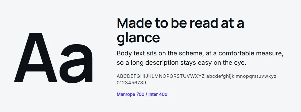
- Pulse headings
- Manrope, weight 700
- Body
- Inter, weight 400
- Heading scale
- 106%
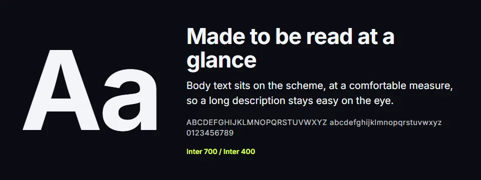
- Volt headings
- Inter, weight 700
- Body
- Inter, weight 400
- Heading scale
- 104%
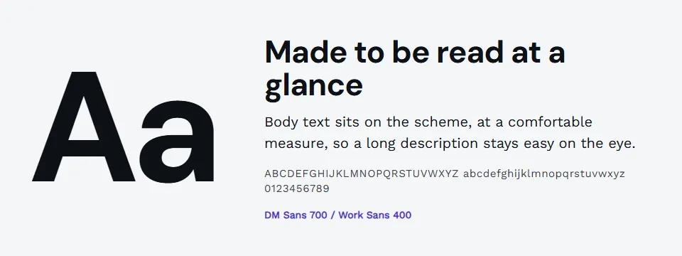
- Surge headings
- DM Sans, weight 700
- Body
- Work Sans, weight 400
- Heading scale
- 110%


| Step | Token | At 360 px | At 1600 px |
|---|---|---|---|
| Small | --ls-step--1 | 13.3 px | 14.4 px |
| Body | --ls-step-0 | 16 px | 18 px |
| Heading 4 | --ls-step-1 | 19.2 px | 22.5 px |
| Heading 3 | --ls-step-2 | 23 px | 28.1 px |
| Heading 2 | --ls-step-3 | 27.6 px | 35.2 px |
| Heading 1 | --ls-step-4 | 32 px | 60 px |
Shape, space and elevation
Pulse
Buttons 40 px, inputs 10 px, surfaces 20 px. Product cards square, 2 per row on a phone.
Volt
Buttons 12 px, inputs 10 px, surfaces 20 px. Product cards 3:4, 2 per row on a phone.
Surge
Buttons 40 px, inputs 10 px, surfaces 20 px. Product cards 4:5, 2 per row on a phone.
| Token | Range | Largest size |
|---|---|---|
--ls-space-1 | 4 px | |
--ls-space-2 | 8 px | |
--ls-space-3 | 12 px | |
--ls-space-4 | 16 px | |
--ls-space-5 | 20 to 24 px | |
--ls-space-6 | 24 to 32 px | |
--ls-space-7 | 32 to 48 px | |
--ls-space-8 | 48 to 64 px | |
--ls-space-9 | 64 to 96 px |
Elevation: Pulse lifts its cards and buttons with these shadows, drawn from the text color of the scheme so they follow light and dark.
0 6px 16px color-mix(in srgb, var(--ls-fg) 22%, transparent)0 10px 30px color-mix(in srgb, var(--ls-fg) 12%, transparent)0 24px 50px color-mix(in srgb, var(--ls-fg) 16%, transparent)0 18px 40px color-mix(in srgb, var(--ls-fg) 16%, transparent)
Icons
Line icons on a 20 px grid, drawn in the text color with one stroke width, so they follow every color scheme and need no icon font.
The build floor is 98% on Lighthouse accessibility for every preset.
The Pulse components
Every part of the storefront the art direction specifies: header, search, cart drawer, cards, forms, footer and the product page blocks, with the product stand-ins drawn for the theme. They follow the look and the light or dark scheme you pick below.
The sections of Pulse
The home and product templates the theme ships, in the order they ship. Every section works on its own, takes any of the four color schemes and can be reordered in the theme editor. The wireframes follow the look you pick below.
Pulse page by page
Home, collection, product, cart and article templates, composed from the components above. Narrow your window to see the phone layout.
Your apps in the Pulse theme
Each of our mini apps where the theme puts it: the Theme Contract v1 slot or anchor, drawn with the theme's own components and tokens. Dashed outlines mark the slot; an empty slot reserves no space in the real theme. Items and prices are sample content.
Three looks, one theme
Each preset has its own colors, type pairing and shape, and four color schemes you assign to any section. Pick one to repaint the demo, the wireframes and the mini apps on this page.
Pulse
Beauty and wellness
Headings in Manrope, body in Inter.
- Cloud
- Blush
- Night
- Volt
Volt
Electronics
Headings in Inter, body in Inter.
- Night
- Mist
- Cloud
- Volt
Surge
Sports and fitness
Headings in DM Sans, body in Work Sans.
- Cloud
- Volt
- Night
- Mist
Beauty and wellness
A heading in the Pulse look
Body text sits on this scheme, so you can judge the colors together before the theme is in the Theme Store.
Add to cart- Type pairing
- Headings in Manrope, body in Inter. The preview uses a stand-in face of the same kind.
- Color schemes
- Cloud #F5F6F8, Blush #F6E7E3, Night #0B0D12, Volt #D8FF4A
Works with our apps
Pulse is complete without any app. With one installed, its widget uses the theme's named places (Contract v1), and where the theme has its own block it steps aside.
Bundle Builder
The bundle offer card sits after the media, in the first app zone after the buy buttons.
Freebies Engine
The theme adds bundle lines and never prices them: the discount comes from our app or from a Shopify bundle.
Quantity Breaks
Sits in the product app zone, right after the buy buttons.
Frequently Bought Together
Sits in the product app zone, right after the buy buttons.
Accessible and fast by contract
Accessible by contract
Built to WCAG 2.2 AA. Every color scheme is checked at build time for text at 4.5:1 and interface parts at 3:1, and a preset that fails does not compile. Keyboard paths, reduced motion and forced colors are part of the checklist.
Fast by budget
The blocking stylesheet and every script have a size budget that the build enforces. Motion is native CSS with a static fallback, and each feature loads its own small file only where it is used.
Complete without apps, faster with them
The Theme Store listing and demo store carry no app. Our widgets use the theme's named anchors (Contract v1), so there is no guessing and no overlap.
Stylesheet budget
Pulse's blocking stylesheet is budgeted at 10,500 bytes over the wire (brotli), 85% of the 12,288 byte ceiling. Every script is a separate file under 3,072 bytes, loaded only where its feature is used.
| Page | LCP | CLS | TBT |
|---|---|---|---|
| Home | 2,200 ms | 0.02 | 150 ms |
| Collection | 2,300 ms | 0.02 | 150 ms |
| Product | 2,300 ms | 0.02 | 200 ms |
| Cart | 2,000 ms | 0.02 | 150 ms |
Measured results
Pulse (Pulse preset), Lighthouse performance score, LCP and TBT per page type, measured on the dev store, mobile, 2026-10-30. Layout shift (CLS) was 0 and accessibility 100 on every page. The other presets share the same hero code and assets.
| Page | Score | LCP | TBT |
|---|---|---|---|
| Home | 89 | 3,506 ms | 101 ms |
| Collection | 91 | 3,212 ms | 107 ms |
| Product | 88 | 3,438 ms | 110 ms |
Release floors on every preset: Lighthouse performance 85%, accessibility 98%, best practices 95% and SEO 100%. Four color schemes per preset, computed against WCAG 2.2 AA for text, muted text, borders and buttons.
Get Pulse when it opens
Price set in the Shopify Theme Store at launch. Early access members hear first.
Pulse is sold through the Shopify Theme Store, which takes the payment. Leave your email and we email you once when it is listed.
Using one of our apps? Their plans are separate: see pricing for our apps.
Other themes to look at
Ledger
An editorial storefront on a ruled, typographic grid.
Try the Ledger demoOrbit
One product, one long story, a buy bar that follows you.
Try the Orbit demo


Questions about Pulse
- Who is Pulse for?
- A floating island header, pill buttons, a bento rhythm and a hero stage whose layers move with the scroll. Built for beauty, wellness, electronics and sports brands. Its three presets are Pulse (beauty and wellness), Volt (electronics), Surge (sports and fitness).
- Do I need your apps to use Pulse?
- No. Pulse is complete on its own. With our apps installed, their widgets use the theme's anchors instead of guessing.
- Does Pulse have a dark mode?
- Yes. Every Pulse preset ships a dark color scheme next to its light ones, and you assign a scheme to any section, so a dark footer or a dark hero is a setting, not a custom build.
- Which of your apps work with Pulse?
- Bundle Builder, Freebies Engine, Quantity Breaks, Frequently Bought Together have a named place in Pulse. The other mini apps work too, where they find their place by detection.
- How much does Pulse cost?
- Price set in the Theme Store. We do not set or show a price here.
Be first to try Pulse
Leave your email and we will email you when Pulse reaches the Theme Store.