Gazette Shopify theme
A newspaper front page for publishers who also sell. The home page is a front page with a lead story, a secondary column and a latest feed. The article is the hero template, and the shop appears inside the story, labelled.
Price set in the Theme Store.

Try Gazette in place
Open full demoA sample store built from the Gazette art direction. Use the bar to switch the look, light or dark and the color scheme; the demo changes in place. It is stand-in content with system fonts, not a live shop.
The page follows your device's light or dark setting; the demo follows the look you pick.
Broadsheet publishers
The weekly edition, delivered where you read.
A masthead, columns and a ruled grid for publishers who also sell: issues, books and subscriptions in one storefront.
SubscribeFrom the shop
- Issue 12, printed editionRisograph cover, 96 pages. Edition of 1,200.
- Poster: The Press Room, 18 × 24 inTwo-colour screenprint.
- Canvas tote, heavyweightPrinted in Lisbon, sample credit line.
- Back issues, set of fourIssues 8 to 11, shipped together.
What makes Gazette different
- Front page section: lead story, secondary column and latest feed from a Shopify blog
- Article template with a 66-character column, a generated table of contents and reading time
- Shop the story: products inline, always labelled From the shop
- Memberships with selling plans and the renewal terms next to the button
- Authors, series and image credits that come from your content
The Gazette design system
Everything a preset is made of, from the settings and tokens the theme ships. Change a preset and these values change with it.
Color schemes
Four schemes per preset, assigned to any section. The ratios are computed from the hex values the theme ships: text is held to 4.5:1 and interface parts to 3:1 at build time, and a preset that fails does not compile.
Gazette Broadsheet publishers
Newsprint
#F3F4F1 · #101214 · #B3261E
- Text on background
- 17.0:1 AAA
- Button label on button
- 17.0:1 AAA
- Accent on background
- 5.9:1 AA
Column grey
#E4E7E2 · #101214 · #A8231B
- Text on background
- 15.0:1 AAA
- Button label on button
- 15.0:1 AAA
- Accent on background
- 5.8:1 AA
Late edition
#0E1114 · #F1F2EE · #FF8F7A
- Text on background
- 16.8:1 AAA
- Button label on button
- 16.8:1 AAA
- Accent on background
- 8.5:1 AA
Masthead navy
#0F2A4F · #F6F7F4 · #FFD479
- Text on background
- 13.3:1 AAA
- Button label on button
- 10.2:1 AAA
- Accent on background
- 10.2:1 AA
Folio Glossy magazines
Gloss
#FFFFFF · #0B0B0C · #B80F4A
- Text on background
- 19.7:1 AAA
- Button label on button
- 19.7:1 AAA
- Accent on background
- 6.6:1 AA
Tint
#F1EEF4 · #0B0B0C · #A60E42
- Text on background
- 17.1:1 AAA
- Button label on button
- 17.1:1 AAA
- Accent on background
- 6.6:1 AA
Black cover
#0A0A0B · #F7F5F8 · #FF8FB1
- Text on background
- 18.3:1 AAA
- Button label on button
- 18.3:1 AAA
- Accent on background
- 9.3:1 AA
Plum issue
#2B1B4A · #FBF8FF · #FFB3C7
- Text on background
- 14.7:1 AAA
- Button label on button
- 9.2:1 AAA
- Accent on background
- 9.2:1 AA
Dispatch Indie zines and newsletters
Butter
#FFF4B8 · #14130E · #1330C9
- Text on background
- 16.7:1 AAA
- Button label on button
- 16.7:1 AAA
- Accent on background
- 8.2:1 AA
Photocopy
#FFFFFF · #14130E · #1330C9
- Text on background
- 18.6:1 AAA
- Button label on button
- 18.6:1 AAA
- Accent on background
- 9.2:1 AA
Night run
#14130E · #FFF4B8 · #9DB0FF
- Text on background
- 16.7:1 AAA
- Button label on button
- 16.7:1 AAA
- Accent on background
- 8.9:1 AA
Blue stock
#1330C9 · #FFFFFF · #FFE45C
- Text on background
- 9.2:1 AAA
- Button label on button
- 14.6:1 AAA
- Accent on background
- 7.2:1 AA
Typography
Faces and weights come from each preset's settings, all from the Shopify font library. The specimens below are rendered in the real faces; this site does not load them as web fonts.
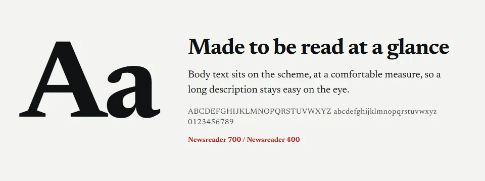
- Gazette headings
- Newsreader, weight 700
- Body
- Newsreader, weight 400
- Heading scale
- 110%
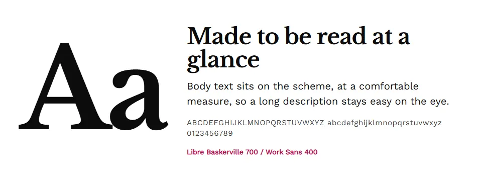
- Folio headings
- Libre Baskerville, weight 700
- Body
- Work Sans, weight 400
- Heading scale
- 104%
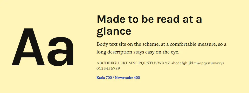
- Dispatch headings
- Karla, weight 700
- Body
- Newsreader, weight 400
- Heading scale
- 110%


| Step | Token | At 360 px | At 1600 px |
|---|---|---|---|
| Small | --ls-step--1 | 13.3 px | 14.4 px |
| Body | --ls-step-0 | 16 px | 18 px |
| Heading 4 | --ls-step-1 | 19.2 px | 22.5 px |
| Heading 3 | --ls-step-2 | 23 px | 28.1 px |
| Heading 2 | --ls-step-3 | 27.6 px | 35.2 px |
| Heading 1 | --ls-step-4 | 32 px | 60 px |
Shape, space and elevation
Gazette
Buttons 2 px, inputs 0 px, surfaces 0 px. Product cards 4:5, 2 per row on a phone.
Folio
Buttons 0 px, inputs 0 px, surfaces 0 px. Product cards 4:5, 2 per row on a phone.
Dispatch
Buttons 6 px, inputs 6 px, surfaces 6 px. Product cards 4:5, 2 per row on a phone.
| Token | Range | Largest size |
|---|---|---|
--ls-space-1 | 4 px | |
--ls-space-2 | 8 px | |
--ls-space-3 | 12 px | |
--ls-space-4 | 16 px | |
--ls-space-5 | 20 to 24 px | |
--ls-space-6 | 24 to 32 px | |
--ls-space-7 | 32 to 48 px | |
--ls-space-8 | 48 to 64 px | |
--ls-space-9 | 64 to 96 px |
Elevation: Gazette is flat. Surfaces are separated by hairline rules and a quiet tile fill, not by shadows, and focus is a ring.
Icons
Line icons on a 20 px grid, drawn in the text color with one stroke width, so they follow every color scheme and need no icon font.
The build floor is 98% on Lighthouse accessibility for every preset.
The Gazette components
Every part of the storefront the art direction specifies: header, search, cart drawer, cards, forms, footer and the product page blocks, with the product stand-ins drawn for the theme. They follow the look and the light or dark scheme you pick below.
The sections of Gazette
The home and product templates the theme ships, in the order they ship. Every section works on its own, takes any of the four color schemes and can be reordered in the theme editor. The wireframes follow the look you pick below.
Gazette page by page
Home, collection, product, cart and article templates, composed from the components above. Narrow your window to see the phone layout.
Your apps in the Gazette theme
Each of our mini apps where the theme puts it: the Theme Contract v1 slot or anchor, drawn with the theme's own components and tokens. Dashed outlines mark the slot; an empty slot reserves no space in the real theme. Items and prices are sample content.
Three looks, one theme
Each preset has its own colors, type pairing and shape, and four color schemes you assign to any section. Pick one to repaint the demo, the wireframes and the mini apps on this page.
Gazette
Broadsheet publishers
Headings in Newsreader, body in Newsreader.
- Newsprint
- Column grey
- Late edition
- Masthead navy
Folio
Glossy magazines
Headings in Libre Baskerville, body in Work Sans.
- Gloss
- Tint
- Black cover
- Plum issue
Dispatch
Indie zines and newsletters
Headings in Karla, body in Newsreader.
- Butter
- Photocopy
- Night run
- Blue stock
Broadsheet publishers
A heading in the Gazette look
Body text sits on this scheme, so you can judge the colors together before the theme is in the Theme Store.
Add to cart- Type pairing
- Headings in Newsreader, body in Newsreader. The preview uses a stand-in face of the same kind.
- Color schemes
- Newsprint #F3F4F1, Column grey #E4E7E2, Late edition #0E1114, Masthead navy #0F2A4F
Works with our apps
Gazette is complete without any app. With one installed, its widget uses the theme's named places (Contract v1), and where the theme has its own block it steps aside.
Freebies Engine
Offers appear inside a labelled Offer slot placed after a paragraph you choose.
AI Chat
Presented as Ask the editor.
Sales Pop
Off by default in this theme.
Quantity Breaks
Sits in the product app zone, right after the buy buttons.
Accessible and fast by contract
Accessible by contract
Built to WCAG 2.2 AA. Every color scheme is checked at build time for text at 4.5:1 and interface parts at 3:1, and a preset that fails does not compile. Keyboard paths, reduced motion and forced colors are part of the checklist.
Fast by budget
The blocking stylesheet and every script have a size budget that the build enforces. Motion is native CSS with a static fallback, and each feature loads its own small file only where it is used.
Complete without apps, faster with them
The Theme Store listing and demo store carry no app. Our widgets use the theme's named anchors (Contract v1), so there is no guessing and no overlap.
Stylesheet budget
Gazette's blocking stylesheet is budgeted at 10,500 bytes over the wire (brotli), 85% of the 12,288 byte ceiling. Every script is a separate file under 3,072 bytes, loaded only where its feature is used.
| Page | LCP | CLS | TBT |
|---|---|---|---|
| Home | 2,200 ms | 0.02 | 150 ms |
| Collection | 2,300 ms | 0.02 | 150 ms |
| Product | 2,300 ms | 0.02 | 200 ms |
| Cart | 2,000 ms | 0.02 | 150 ms |
Measured results
Gazette (Gazette preset), Lighthouse performance score, LCP and TBT per page type, measured on the dev store, mobile, 2026-10-30. Layout shift (CLS) was 0 and accessibility 100 on every page. The other presets share the same hero code and assets.
| Page | Score | LCP | TBT |
|---|---|---|---|
| Home | 96 | 2,272 ms | 123 ms |
| Collection | 95 | 2,674 ms | 82 ms |
| Product | 92 | 2,825 ms | 33 ms |
Release floors on every preset: Lighthouse performance 85%, accessibility 98%, best practices 95% and SEO 100%. Twelve color schemes across the three presets and 120 text, muted and border pairs computed against WCAG 2.2 AA, with no failures.
Get Gazette when it opens
Price set in the Shopify Theme Store at launch. Early access members hear first.
Gazette is sold through the Shopify Theme Store, which takes the payment. Leave your email and we email you once when it is listed.
Using one of our apps? Their plans are separate: see pricing for our apps.
Other themes to look at
Vellum
A brand story told in numbered chapters, ending at the buy button.
Try the Vellum demoLedger
An editorial storefront on a ruled, typographic grid.
Try the Ledger demo


Questions about Gazette
- Who is Gazette for?
- The home page is a front page with a lead story, a secondary column and a latest feed. The article is the hero template, and the shop appears inside the story, labelled. Its three presets are Gazette (broadsheet publishers), Folio (glossy magazines), Dispatch (indie zines and newsletters).
- Do I need your apps to use Gazette?
- No. Gazette is complete on its own. With our apps installed, their widgets use the theme's anchors instead of guessing.
- Does Gazette have a dark mode?
- Yes. Every Gazette preset ships a dark color scheme next to its light ones, and you assign a scheme to any section, so a dark footer or a dark hero is a setting, not a custom build.
- Which of your apps work with Gazette?
- Freebies Engine, AI Chat, Quantity Breaks have a named place in Gazette. The other mini apps work too, where they find their place by detection.
- How much does Gazette cost?
- Price set in the Theme Store. We do not set or show a price here.
Be first to try Gazette
Leave your email and we will email you when Gazette reaches the Theme Store.